Thursday, May 29, 2008

Image in Music Promo


Music Public Relation practitioners help musicians build and preserve a positive public image which they do so through specific strategies and tactics, such as the music video, personal imaging, album cover and logo. Apart from personal image being important in Public Relations, visual imagery in strategies and tactics used are important. For example PR practitioners analyse images in editorial content to measure how effective their strategies were. The idea of a band is to get their message across to their audience, which they do so through the medium of sound. However, sound goes hand in hand with image (both visual image and personal image). Images are used to promote the sound. The purpose of a music promoter is to employ strategies that evoke a response for the public through the visual artefact that is placed in front of them. However, what works for one person may not work for another person. Different genres of music evoke different responses in different people, but as a whole the imagery that is trying to be portrayed needs to have a sense of feeling that gets to the core of what resonates within the individual.


Music Video


In the fifties, the only video recordings of bands were based in TV stations where bands were invited to perform on TV shows such as Bandstand and Uptight, the Ed Sullivan Show (US) and Top of the Pops (UK). At the time, only the biggest bands made their own self-promoting videos, such as the Beatles and the Rolling Stones. In the seventies, the climate changed so that shows were developed specifically for broadcasting and promoting the videos of bands. Legendary shows including Countdown and the pioneer of the 24 hour of marathon music video broadcasting, Music Video were the fore bearers of the great institution of MTV, beginning in the 1980’s in America and spreading to Australia in the mid eighties. Video Killed the Radio Star was the first song played on MTV in 1981. MTV's line-up originally consisted almost entirely of rock videos, short films in which singers or groups usually lip-synched their newest releases. MTV’s own style, widely imitated, was typified by jump-cut camera work and busy graphics carefully designed to look spontaneous (Knight 2000, pg1). Closer to home, without a video it was hard for overseas bands to get exposure in such an “isolated” country, for a long time Australia was not included on the tour bill. The Australian music video industry developed along the same lines as the industries of other major Western music centres such as UK and USA, although initially it was dwarfed by the size of those industries.


Bands were starting to realise that a video was an important part of their promotional activities, as it was an effective visual medium to showcase their songs to the wider audience. Music videos gradually became imaginative, and incorporated creative camera and film techniques, such as The Beatles video of Strawberry Fields Forever. In the sixties it was a cheap and low budget video, with the band lip-synching on stage while a group of teens swayed in front. In the seventies a story began to be told, with the eighties an extension of that. The nineties brought in special effects in the music video. Today no band releases new material without an accompanying video if it is looking for commercial success.


Personal Imagery


Bands and musicians have always been image conscious, with the wish to exude a specific attitude relevant to their audience. Different genres of music seem to create a following of groups or subcultures that emaulate a particular personal style that visually represents that genre of music. Visually, one is remided of a style of music through the style/fashion that an individual incorporates onto their body. The current Hip hop scene has created its own subculture, with a strong egotistical focus. In turn making the viewer wonder if the contemporary music video is just a maxicommercial where advertisers subliminally place products and PR practitioners watch the media feed off their client’s clips.


Album Covers


Record albums are often the first point of physical contact a listener will have with a band they like; a standout album cover is therefore important. From the vinyl record to the cd, covers have been historically and visually analysed by critics and listeners. Professional artists may even become involved in the process, for example Andy Warhol designed the cover for the Sticky Fingers album for Rolling Stones, featuring a real zipper on the original vinyl. Pink Floyd considers the multi-dimensional aspects with colour, shape and almost brings the viewer into the scenery of the cover of Dark Side of the Moon.


Posters/ Band Name/Logo


The use of posters, logo and even the name of the band, takes music marketing into a new form of art. Posters and logos must give a sense of recognition that evokes in the viewer the desire to research the band further. Often the most effective logos are the most simplest (an age old idea), for example the Pink Floyd triangle/rainbow symbol, the Rolling Stones mouth, the ACDC lighting bolt, the Queen logo, or Outkast’s crown logo. Some bands have their band name in a constant recognisable font to distinguish them, for example NOFX, My Chemical Romance and Kiss. Some artists go even further and utilise a specific hand gesture, such as rapper Jay-Z.


Online


In contemporary life, online strategies are very important in the promotion of a band. Images are essential in Internet presence. The website needs to be user-friendly. Something may look fantastic, with interesting images, but then it takes hours to simply navigate around to the gallery page. Often, the band’s logo will feature throughout the website, as well as a picture gallery including album images and photos of band members.

In music promotion it is important that visual works with audio. Images create a sense of ownership in the viewer. Does the imagery induce a sense of connection, that the viewer can call their own experience, and the ability to have a journey within your own imagination? If an image is successful in doing this, the message that the image is trying to portray will come across. Hence if a band’s poster, logo or album cover has the perfect qualities and design elements that would appeal to its target audience, then it will be successful in relaying the band’s audio message. Images are important in conveying the “spectacular” of a band to their listeners. Music PR practitioners use these images and create the personal image of musicians to help with their public image which they do so through specific strategies and tactics.

Wednesday, May 14, 2008

The Flunks

Once upon a time, Indie sat upon a rock. With it’s hard foundation it attracted a lot of attention and junk along the way. But when the rock merged with the establishment, Indie departed. She occupied a jukebox for a while, where she came across Punk. Punk went to sleep and his friends thought he was dead. He was simply resting as he waited for a Renaissance. He didn’t know if it ever came, but he had a feeling. So Indie married Punk in the plight to open his eyes.

Hailing from Brooklyn, New York these child-like musos don’t follow any rules. It’s like neo-magic out of the twilight zone with a punk twist. The Flunks frontman Tony says “You’ll remember the day you fell in love with music. Because today is the repeat of your love affair with sound”. No, they haven’t turned into princesses since their last album, but shifted to what they call a more awakened Indie-Punk. Very existential. When was the last time you fell down and couldn’t get up by yourself? Be it blasé or cliché, with a gravity shift, the Flunks will crush the groundwork and stampede your heart’s momentum. No one ever said you can’t be in love without being a sissy. Their 2008 album Ceci N’est Pas Une Band is due out in August. The idea of the album title and imagery came from a famous painting of a pipe by René Magritte.

The Flunks help lighten the feeling of cleaning out dirty sinks and drains if you do it while listening to “Never Too Old For Scooter Love”, which is the first single, due out in July. One song is sad. “Lola’s Hotdog” bluntly put oozes lines of dismay and lonesome. The feeling is that there is no hope. There is no upbeat feel, it is a folk song of impossible qualities. It is truly believed until the ending, where a C major chord sparks a light, and you can see through the tunnel which was originally a hole of blackness with a whole lot of sadness and a hole to peek through and see. This lends the track to being one of the best of the album.

As their moniker would associate, none of the group members flunked out of…anything. All four finished highschool and two of the boys graduated from Arts Colleges. So then where did the name come from? One sunny Downtown day, bass player Scotty was writing rhymes. He realised a lot of cool words ended in ‘unk’. Junk, Punk, Crunk, Funk etc, until he came to Flunk; the finest of them all. It was also very anti-establishment, an imperative image-consciousness to have if he wished to stay a part of the scene he was apparently in. Scotty now also has a fetish for hyphenated words, so uses this tendancy frequently in his song lyrics.

Between albums, The Flunks headed down under to Australia where they recorded four songs off their latest album and meshed with the local talent. They played one Sydney show to sold out fans. Although flanno fashion seemingly died out, The Flunks brought it back with their 2006 released EP, Flanarchy, and had fashionistas in confusion of whether or not to “Embrace the Flannelette”, which was the first track on the album. It was a Sex Pistols inspired album, with extra safety pins, more plaid and plenty of anarchist satire.

They are not so much post-Punk anymore, but more post-Indie on their latest release, with an experimental rock sound, Jimmi Hendrix-likened guitar riffs and Robert Smith-esque (The Cure) vocals.


Rules never stopped a child, so they shouldn’t stop you.


*****


This review also appeared in Sickling Magazine, and features on the bands Myspace page.


Saturday, May 10, 2008

MGMT

Oracular Spectacular


MGMT's Oracular Spectacular takes me back to a time that I hadn't actually been alive in, but feel like I could have been just by listening to their 2008 Sony released album. These boys are straight out of the seventies and have got me crazed on a whole other psychedelic level that I'm left confused. Dumbfounded in a good way. I don't know where to place them. Are they indie rock, experimental, alternative, jungle-surf-safari? I suppose this is a good thing; if you can't be labeled, then the pressure for future conformity disappears. Even checking out the band's website is a trippy experience. Whoismgmt.com is (purposefully?) strange with bold colourful images and a grid placement that wouldn't quite work if you didn't understand the band's mentality.

The album sleevage "invites you to open your mind to the multi-dimensional vibrating Technicolor sounds of Oracular Spectacular". It is an artistically motivated photographic diary of Ben Goldwasser and Andrew VanWyngarden, who used to be known as The Management.

Thankyou freedom of speech for allowing us access to lyrical purity evident in all tracks especially 'Time to Pretend'. "I'll move to Paris, shoot some heroin, and f*** with the stars. You man the island and the cocaine and the elegant cars". They jump a decade with their eighties-sounding synthesizer. MGMT bring back the feel of vinyl in 'Pieces of What'. ''Electric Feel' has disco influences but seems to emulate its own genre, creating funky existential ecstasy. With its finale instrumental riff, 'Of Moons, Birds & Monsters' is the kind of track you need when you're driving by yourself on a long deserted highway at night. 'Weekend Wars' makes you want someone in that passenger seat.

I feel like these Brooklynites are the fore bearers/brainchild of some great musical institution/innovation that is yet to come. In this way I label this band "indie neo-acid retro electronica, boheme-hippie psychodelia rock, with a stroke of much-needed audio genius". MGMT are a hallucinogenic metaphor for what can only be called; good music. Refreshingly odd, yet undecidedly potentially mainstream (well, 40 years ago).

Their EP, Time to Pretend also has worthy tracks such as 'Indie Rokkers' and gives way to the suspenseful anticipation that Oracular Spectacular satisfies.

They're real and they're spectacular.


Comments? don't agree?
Let me know if you feel the same blissful nostalgia...
Listen to MGMT on my iPOD to the right...

Photos: Courtesy of Wikipedia

I Used to Love Hip Hop in its Essence & Real


With the rise of global, mass produced, media based "hip hop", all I can stand to listen to these days from this genre are artists like Common, who still exude the same real feel that hip hop grew up upon. Released in 1994, I Used to Love H.E.R is my favourite Common song, although he was still Common Sense at that time. Classic hip hop artists are a rare thing nowadays, but I think Marco Polo defines the cut with Nostalgia and makes me "Backtrack turn back the page".


Even album covers don't strive for that creative element anymore. Music is art, so it goes to stand that the music sleevage should represent the item it contains. Not such a big fan of the Biggie posthumous release, and with the exception of maybe one song, the artists doing the duets probably should have sticked to their own niche and not cramp Biggie’s reputation. OUtkast’s ATliens and Aquemini are trying to reach a bit out of the hip hop box (though pre Stankonia), but still stay there with their bling and booty reminiscent images. I just think hip hop needs to get out the box/label that it’s been put in along with r&b and rap, as there really are great artists of this genre out there eg. Common, Talib Kweli, Maxwell, Mos Def.


Not so bad Album covers include: The Roots-Rising Down, Beastie Boys, Erykah Badu has some cool illustrative ones like World Wide Underground. Miss Badu is the quintessential Afrocentric queen; her lyrics, sense and image corroborate this. A lot of old school artists seemed to elaborate on comic styles, such as GZA - Liquid Swords.

Lots of covers have/had the potential to be exciting, but lacked this element due to artist ego or record label wants, or the need to conform to all that glitters must be good…

Hip hop was defeated by ego and sold out to commercialism.
I used to love h.i.m so there's still hope.

Thursday, May 8, 2008

Rip-offs Done Well


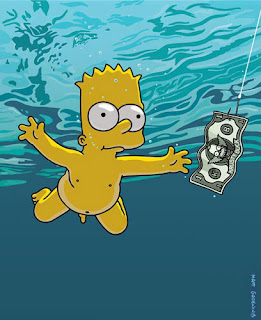
Weird Al Yankovic cleverly parodies Nirvana's Nevermind album cover, followed by the Simpsons satirical rendition. Apparently Cobain refused censorship of the image (rightly so) and his only compromise was a sticker on the baby's appendage that read, "If you're offended by this, you must be a closet pedophile."

Wednesday, April 30, 2008

Sunday, April 6, 2008

Branded Couture


Generation-Y is the ultimate consumer group, relying more heavily on brands than ever before. The only way to get the attention of this brand-crazy generation is to enlist innovative ideas in a campaign strategy using effective communication design that uses a language that speaks directly and indirectly to the consumer’s experience. Public Relations is a cultural experience. Campaigns and PR are offshoots of personal branding. A brand is a sample; when one uses a brand, one is sampling an aspect of that brand’s whole identity. For example, fashion lines create samples of their products/clothes for buyers to try before they buy in bulk for their store. A PR campaign, an event or a launch for a product creates the opportunity for consumers to sample that brand.
Image: Author's Own

Saturday, March 22, 2008

VOTE [1]

Campaign Design
-cultural design experience focus


Planning is central to any Public Relations campaign. Design a fresh campaign and you’re looking at loads of exposure for your brand, often in ways more effective than simply advertising. A public relations campaign brings together the forces of design and creativity within a marketing based approach. Many PR agencies these days join forces with graphic design companies to give them an extra edge when it comes to the design of more exclusive ideas. Often the concepts are unmatchable, exposing a new brainchild to represent the brand. They can print on-demand, eliminating the hassles of having to find the most desirable design company. For example, Public Relations company Zing Australia internally contract their own graphic designers. The basic principles of design can be employed in campaign development. When multiple mediums are implemented, the message will be further understood, for example, visual metaphors utilized for a more rounded user experience.

Research is the backbone of any good quality campaign. Decipher the market, the target audience and know the current situation behind the client’s need for a campaign. Decide how you will go about doing the research; your methods, timeline and what you wish to achieve through this research. You may even find a niche audience you didn’t know you had. Swarovski crystals merged with Revolution Eyewear to keep their ideas fresh and in turn, adopted Revolution’s audience. When IKEA furniture needed legitimacy in the design world, they targeted bloggers. Not only was this a cheap method to place editorial content, but the World Wide Web provided IKEA with a whole new audience.

When designing a PR campaign you need to establish your intentions and define your objectives. Knowledge is also the key to a successful campaign, so learn all you can about your client and the brand that you will be designing the campaign for. Discuss the history of their business, their goals and the message they wish to portray in life and through the campaign. If you understand the client’s message, the intended audience will understand the message. One objective of sandwich chain Subway’s 2006 campaign was to firmly establish them as owners of 'Subs'. Just as McDonald's had a Big Mac and KFC had the Bucket, they needed a product or language that was theirs (McGhee 1). However, you may recall that McDonalds released their “healthy” Deli sandwich range; suspiciously resembling a Subway sandwich, followed closely by KFC Subs. Another innovative idea was needed. In design terms, the new brief called for an instantly recognisable Subway product and needed to be seen as fresh and accessible. The new look and language formed the beginnings of their brand personality (McGhee 1). Subway began with its original black logo and changed to its current recognisable green logo to create a more “healthy and fresh” approach. They also partnered with Coca-Cola, who assisted in the growth of their brand identity.

”In any design thinking, resolve what message you want to send out to your public, and incorporate this into the campaign strategies” (Dugan 1). The President of the Nike brand once said, “Focus on saying less, but say it really well to generate more excitement than you might otherwise around a product. IKEA's message was that their product designs could make everyday life better. So they staged an outdoor exhibition throughout New York City, and placed their designs in everyday places; cushions on park benches, a couch in a bus shelter, hammocks strung up between trees on a street corner. This made it fun to wait for a bus, whilst also defining and promoting their key message.

In putting together a campaign strategy, the campaign director is seeking to construct a complex meta-narrative that sends a multiplicity of variations on the key campaign message to a variety of targeted audiences in various configurations by assorted media over the length of the campaign Is this a quote? (Johnston 411). Develop an exceptional insight into the brand, to outshine its competitors. If the brand has been around since the fifties, a campaign can be designed to re-launch it to show off its new packaging. You need strategies to promote and represent the brand. Make the promotion of your brand into an event. If you think you have a good idea, stick by it even if it’s deemed “crazy”. However, think about dropping it if it’s considered “insane”. Basically, just don’t be a toothless tiger when it comes to design and creation.

Find ways to turn your brand into art, as visual stimulus often provokes more attention than simply a bland media kit. Create more than just a funky logo. Breathe an identity into the campaign; give it a name. Design an event to be the climax of the campaign, and give it a catchy name. Turn Centrepoint Tower into a banana if need be (and if budget be). This will help when pitching your ideas to the media. Journalists feed off wild and fanatical names such as Ryvita’s “Big Taste, Mini Waste” campaign. Give out more than just a media kit; furnish a treasure hunt and you are bound to get more editorial content in major newspapers.

When you’ve completed all the previously mentioned groundwork for the campaign, analyse it. What are its strengths and weaknesses? What opportunities does it provide, and what threats need to be considered? What are the health and safety risks involved in putting a couch in a bus stop, for example. Make sure you have a clear timetable for the details of the campaign. When will brochures need to be sent out, what night is the launch; don’t leave room for error or memory wipes. Once the campaign is over, the work still isn’t finished. Evaluate the campaign and its effectiveness in relation to the original goals. This gives you the opportunity to improve the design for next time.

For a campaign to be successful, thoughtful design must be considered, whilst also using effective visual communication. The elements of planning and research must be applied carefully. Once the client’s goals and objectives are defined, a decision of what strategies and tactics will be used is in order. If designed well, campaigns will improve brand perceptions, give a little joy to jaded folks and cut the time they spend trying to outwit their neighbours.


Works Cited

Dugan, K. Nike’s Impactful Approach to Media Relations. September 20, 2007 http://prblog.typepad.com/strategic_public_relation/2007/09/nikes-impactful.html

Johnston, J & Zawawi, C. Public Relation Theory and Practice. Allen&Unwin 2004

McGhee, G. & Kiely, D. Subway: On a Roll: how the regional trial of a repositioned and re-branded existing product for UK sandwich chain Subway led to a fully integrated global communications success story. Frame Agency 2007

Thursday, March 20, 2008

Race Relations – Aussie Pride


A Break from Fashion. The other side of Communication practice.


Hyphenated Identities: The Mixed-Race Public in Australia

With Australia’s fusing cultural shift, has blossomed an active public commonly referred to as those of “mixed-race”, among other terms. They are a people more than likely to be born in Australia, but have one parent of a certain ethnicity and the other parent of another ethnicity. They are a public who want to know if they are any less ethnic than their “pure” counterparts, where they fit in and how their identity is relevant to Australia’s changing society. These “hyphenated identities” are an emerging counter public whose roots arise from the continuous geographical shift and immigration of races.

Mixed Marriages from Colonial Times Until Now

There has long been a history in mixed-race marriages in Australia from its colonisation. When the first settlers came to Australia, there were plans to ship Pacific Islander women to the land as companions for the white males. However, this plan was not carried through and marriage began to occur with Aboriginal women. A lot of people did (and still do) use the issue of mixed-race children to discourage interracial marriages.

In the 1850’s, the Gold Rush brought a number of immigrants to Australian shores. Most common were the Chinese, who were already disliked, and even more so when they began to marry Australian women. The White Australia Policy was not abandoned until 1966, by the then Prime Minister Harold Holt. The next year, Aboriginals were given full rights and citizenship. In the United States at the same time, Black/White marriages became lawful in nineteen states. By 1971 governments were working towards a harmonic multiracial society. Italians and Lebanese have had high immigration rates since the sixties, and more recently Africans along with Middle Eastern migrants. With constant immigration from a plethora of countries onto Australian shores, immigrants are practically forced to integrate into the host community, resulting in the recent upsurge of mixed-race people in Australia.

Mixed peoples are further outcast by geographical ethno-cities, for example Sydney’s Chinatown and Little Italy, that constitute the suburbs of Haymarket and Leichardt respectively. These racial boundaries are a form of exclusion. Residential segregation between ethnicities has come about (especially in Sydney) often as a result of language barriers or lack of proficiency in English, notable excessively in Western Sydney. This may not be the case with children of mixed race, as often the common language between the parents is English.

Communication Practices and Discourse

In the distant future, as races constantly intermix, it seems it will be impossible to define ethnicity or race. I believe that the vocabulary when talking about ethnic mixing is limited. Their discourse shows that they are aware of their possible alternate identity. This can be shown as the product of the ever-increasing globalisation of the world.

Culture does creates a newness, entertainment and a solid base (among other things) for people. This creativity is healthy as long as it doesn’t lead to racism. Nationality seems to provide a topic of conversation, or entry into one for those of a single ethnic background. However, there is a struggle to find appropriate names for collective identities.

In the plight to categorise people by their cultural or ethnic characteristics we have forgotten the notion of basic human rights and have opted instead to define a person by their “race”. Perhaps we should all call ourselves simply Australians, creating a single national-ethnic identity, based on where you were born rather than your ancestry. However, if this is to be the case it will certainly take time, as race does still matter to most people. In a sense mixed-race people fit into the future meaning of culture and are evidence that resistance to change is futile. Although still a soft voice, biracial people demand a voice equal to their ethnic counterparts and a willingness of others to deconstruct their identity as an emerging public in cosmopolitan Australia.

Proud to be Australian
Image: Can't remember, possibly some graf artist in Newtown

Monster Children


Undoubtedly the coolest magazine ever.
Indie design culture meets surf lifestyle, who married fashion's half-sister's cousin and then found out their parents were a music festival, who had just given birth to alternative illustration. They castrated their advertisment of a brother, who had devastatingly just found out his girlfriend was a top 40 chart hit. They were deemed the next generation known as Monster Children.


Check it out in Oz.
And they don't even pay me to say that, so it must be good.


Image: Courtesy of Monster Children


Converse Renaissance


Chucks making a comeback from the alternative stigma they seem to have had for a while, to a more skate urban style that they originated from as a basketball shoe in 1917, but still retaining its rock edge. The All-Star shoes were popular in the late sixties, late eighties and now, reflecting a double decade trend reminiscent of leg warmers, peep-toe shoes and high-waisted jeans. They are now utilizing crazy fluoro colours with funk-tastic designs I see every time I window shop past General Pants. Love it.


Image: Courtesy of somehwere on the World Wide Web, probably Wikipedia


Forgotten People – Darfur


As the Darfur crisis heightens, there needs to be more the average person can do. Fashion industry types have greater buying power so it’s up to those passionate about the issue to get their voices heard.

Over 400,000 people have died, and more than that number are displaced people living in cluttered refugee camps. Children are growing up in rat-infested slums with dirty water in a continent that among other things, is already over-run with AIDS. The presence of the UN is not respected in the area. The Darfur Peace Agreement was signed in 2006, having little affect on the whole outcome.

In 2007 Designers for Darfur staged a fashion event collaborating with New York Fashion Week to raise money and awareness for the cause. Australia launched its Art exhibit featuring Sudanese artists. The “Forgotten People” project showcased artwork/installations to remember the people of Darfur. Currently it is only in Melbourne and I wish to extend it to Sydney. What is being done now? I mean, apart from cutting the number of African refugee entrances into Australia, which hopefully changed under the new Labor Government.

You can help too. Ask your local council to create an interactive Public Education Campaign, created to offer information, education and awareness to the public through various practical activities and informative handouts. Do you own an Art Gallery? Raise awareness through the Arts. Everyone desires something. Those suffering in Darfur desire freedom from their oppression, just as an Australian teenager desires a successful career.

Darfur Australia Network are currently running a campaign called Dream for Darfur, which correlates with the 2008 Olympics in Beijing. China is a major player in the Darfur crisis. China is currently supporting Sudan financially with a history that, like so many wars, stems from Oil. Fashion producers can alter China’s economic performance by boycotting use of their clothing sweatshops. It’s almost a case of karma, where each person’s actions has an equal and opposite reaction. Force China to stop their investments, in turn forcing the Sudanese Government to stop the genocide. Steven Spielberg has already resigned as Artistic Director for the 2008 Olympics.

Sydney fashion and art gurus can do something about it. Now is the time, as focus shifts towards China for the 2008 Olympics.

Check out
http://www.darfuraustralia.org/


Image: Courtesy of Darfur Australia Network 08

MTV Junkie


Why can I spend hours on end watching MTV? There must be a formula that gives it that McDonalds conglomerate type status that I can’t seem to resist. And how do they know to put day-long Jackass marathons when I have a day off? Take ‘The Hills’ for example. Or ‘Laguna Beach’ . Lauren is the epitome of the fashion intern. Working at Teen Vogue, she attends parties and events nightly. Oh L.A. My sweet Sydney is beginning to poach your style. Wednesday is the new Saturday. Nightly I see fashionistas parading the streets of the ever-trendy Kings Cross. I’m a hypocrite. Happy to admit, self-confessed superficial queen. Spying on chic clubbers one night, then joining them in a funky outfit with hooker heels the next.

But back to my addiction; these shows present a story that is supposedly fact-based. Often people think events on television are real, simple because they are on television. “Reality” TV also employs similar techniques in a supposedly non-scripted format so that viewers believe what they are watching is complete truth. I used to think the show was not real, until an Aussie came on the show. Sure they may have hired an actor, but we all remember Meryl Streep’s “a dingo ate my bab-ey”. I still don’t know if ‘The Hills’ is real. I’d be happy for someone to enlighten me, and as much as I don’t want to admit it, I’m an MTV junkie.

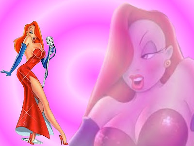
Recently, ‘Newport Harbour’ takes the spotlight. Second place awarded to ‘Maui Fever’, ‘Living Lahaina’ and too many more. Even more freakishly, I find myself referencing every day occurrences of my life to these shows. One night out I saw Justin Bobbys everywhere. These shows are portrayed as non-fiction, but is it fiction? A parody of the stereotypical Valley Girl. Or maybe they're just drawn that way, like Jessica Rabbit. Are the producers simply making a mockumentary out of me watching it? Candid camera style.
Image: Courtesy of the Internet and its crazed phenomenality.

Wednesday, March 19, 2008

The Fluoro Revolution


Today’s fluoro fashion is what the seventies would be like if they had glow sticks on a mass scale. Psychadelic hues that blind your eyes with a catchy logo. It’s all you can see for miles at Australian festivals like Good Vibrations and Future Music. Even the Big Day Out wanted a piece of the action this year. I don't even need to mention the crazed sunglasses fad. Thick colourful frames, disposable yet fashionable pieces of plastic. Although targeted to a younger audience, I gave my dad some fluoro wear for his birthday, and make him wear it :).

I haven’t been overseas since the fluoro trend began spreading its wings on our shore, but it seems to me like it’s an Australian thing. Though please correct me if I’m wrong. Perhaps an appropriation of the popular construction worker culture who wear fluoros on a daily basis. Doing a year-long stint in a warehouse, I had to wear bright yellow fluoros which I actually thought brought out my skin tone nicely. However my co-workers didn’t take too kindly to their wardrobe obligation.

Talking to a few people who either just moved here from the States or were here on holiday, they thought that our fashion sense made us appear to steer towards alternative orientation, particularly for males. Not that there's anything wrong with that (Seinfield style), these people were quite vulgar in their terminology. But I quite love the fluoro revolution. What’s it like in your country?


Image: Authors Own. Good Vibes08

Fashion-easta


I salivate earlier and earlier every year as Easter eggs begin to line the shopping centers. Except for this year. It’s Easter, but where is all the chocolate?

I crooned over one egg that my lecturer gave to everyone in my class. It wasn’t enough. The seed has been planted and the taste is there. One small sample and I’m not satisfied. I ponder. What happened to the promotion of Easter this year? Did Cadbury forget to mark an important event on their Calender? Did Lindt decide that their customers have known for at least 1060 years when Easter actually is? I guess I’ll just have to wait a month or two before they start putting Christmas decorations up.

Designers it seems, have taken over the Marketing responsibilities this Easter. Henry Holland created a “Fashion Easter Egg” for Thortons, in a collection that will be shown at London Fashion Week.


Designer eggs. Yummy.


Image: Authors Original 07